> ## Documentation Index
> Fetch the complete documentation index at: https://docs.kubex.ai/llms.txt
> Use this file to discover all available pages before exploring further.

# Utilization Charts

export const InlineImageWithText = ({src, href, children, width = 80, caption}) => {
  return <span className="inline-flex items-center gap-3 align-middle">
            <a href={href} className="inline-block border-b-0">
                <Frame caption={caption}>
                    <img src={src} alt="" className="object-contain align-middle " width={width} style={{
    minWidth: width
  }} />
                </Frame>
            </a>
            <span className="align-middle">{children}</span>
        </span>;
};

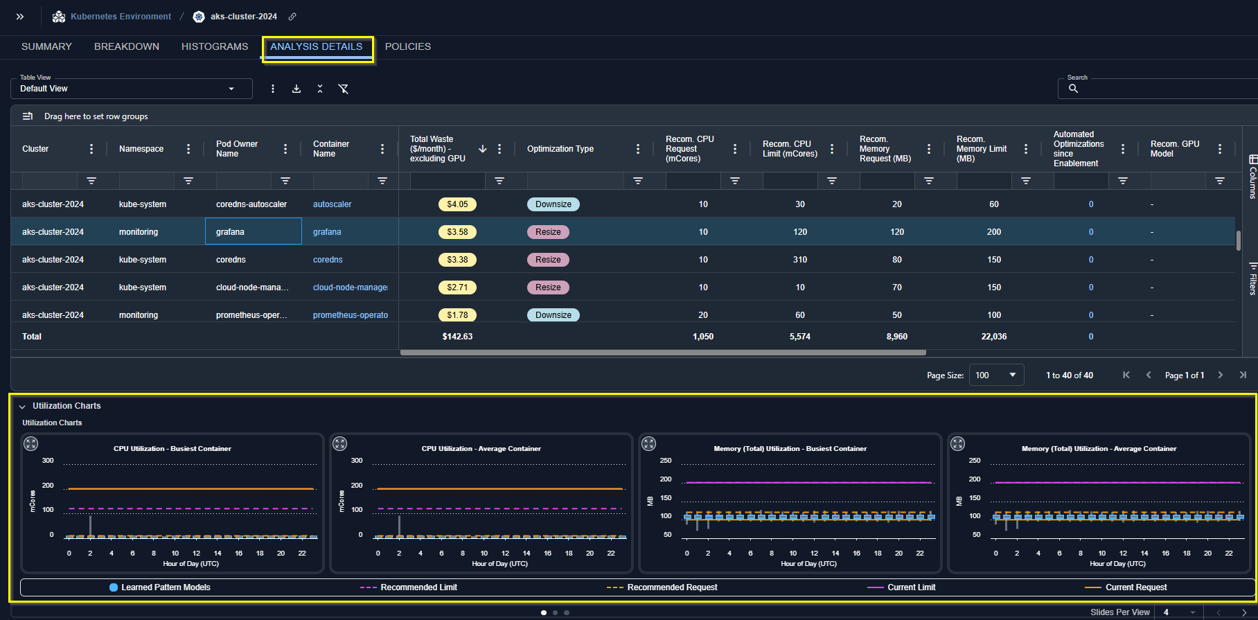
Clicking on any row in the tabular report, in the upper pane, shows the utilization details in the Utilization Charts, in the lower pane. These charts show 24-hour utilization patterns for key metrics, derived from Kubex analysis.

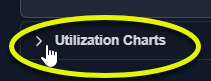
If the lower pane has been collapsed, click the icon in the upper left corner to expand the pane.

<Frame caption="Expanding the Lower Pane">
  <img src="https://mintcdn.com/densify/It6BkcRegrIhp2zo/images/docs-kubex/Content/Kubex/03000139.png?fit=max&auto=format&n=It6BkcRegrIhp2zo&q=85&s=88cbc9321c5253c59a5c2153fd3296dc" alt="" width="211" height="81" data-path="images/docs-kubex/Content/Kubex/03000139.png" />
</Frame>

<br />

<iframe src="https://www.densify.com/docs-kubex/Content/Resources/Gifs/193-Expanding-Charts.mp4" width="100%" height="480px" />

<br />

<Frame caption="Figure: Locating the Utilization Charts">
  <img src="https://mintcdn.com/densify/qkPZFArjNU_c5QkI/images/docs-kubex/Content/Kubex/03000120_676x432.png?fit=max&auto=format&n=qkPZFArjNU_c5QkI&q=85&s=831b42ba109500df8f95f3356127723c" alt="" width="1816" height="895" data-path="images/docs-kubex/Content/Kubex/03000120_676x432.png" />
</Frame>

Utilization charts show hourly min/max and sustained activity for the selected system. The charts show the current and the recommended request and limit values for selected metrics.

Use the left/right arrows to scroll through the utilization charts. The following charts are available:
<table>
  <tbody>
    <tr>
      <td>
        <ul>
          <li>CPU Utilization in mCores - Busiest Container</li>
          <li>CPU Utilization in mCores - Average Container</li>
          <li>Memory (Total) Utilization -  Busiest Container</li>
          <li>Memory (Total) Utilization -  Average Container</li>
          <li>No. of Containers</li>
        </ul>
      </td>

      <td>
        <ul>
          <li>Memory (RSS) Utilization - Busiest Container</li>
          <li>Memory (RSS) Utilization - Average Container</li>
          <li>Memory (Working Set) Utilization - Busiest Container</li>
          <li>Memory (Working Set) Utilization - Average Container</li>
        </ul>
      </td>
    </tr>
  </tbody>
</table>

<Note>
  If the required metrics are not available, the corresponding charts are not displayed.
</Note>

## Using the Utilization Charts

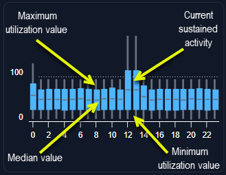
Utilization charts display current sustained activity in blue. The minimum and maximum utilization values are shown as vertical lines above and below the coloured block. The median is indicated as a grey line within the coloured block.

<div style={{display: 'flex', gap: '20px', justifyContent: 'center', alignItems: 'center'}}>
  <Frame caption="Figure: Utilization Chart Data">
    <img src="https://mintcdn.com/densify/zZdJaPjmZYmfrfqT/images/docs-kubex/Content/Kubex/03000069.png?fit=max&auto=format&n=zZdJaPjmZYmfrfqT&q=85&s=c078b80f2ab0cf231eeb7021a0a222bb" width="329" height="254" data-path="images/docs-kubex/Content/Kubex/03000069.png" />
  </Frame>

  <Frame caption="Figure: Utilization Chart Request/Limit ">
    <img src="https://mintcdn.com/densify/zZdJaPjmZYmfrfqT/images/docs-kubex/Content/Kubex/03000070.png?fit=max&auto=format&n=zZdJaPjmZYmfrfqT&q=85&s=efe4dff87e2d0acfb7a1cf9bbee335ac" width="385" height="256" data-path="images/docs-kubex/Content/Kubex/03000070.png" />
  </Frame>
</div>

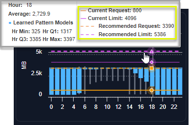
The Y-axis is scaled dynamically to match the range of data. The orange line, indicating the current request setting is shown and the setting of the Y-axis scale also accounts for the request setting. The pink line indicates the current limit.

If the request and the limit are the same, the dashed orange/pink line indicates the value. The units of the workload are also shown on the Y-axis.

Recommended CPU and memory settings are shown as dashed lines. Refer to the legend located below the charts for details.

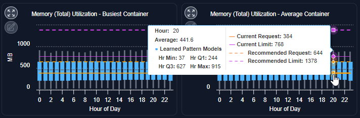
Hover over any time or date on the current or recommended lines and click to see the detailed data.

An icon in the corner of each chart provides a zoom feature:

<InlineImageWithText src="/images/docs-kubex/Content/Kubex/03000038_46x44.png">
  You can zoom in on the chart for easier viewing. All information indicated above is provided so you can review hourly data for the selected container. Arrows on each side of the selected chart allow to scroll through the other available charts.
</InlineImageWithText>

<Frame caption="Figure: Utilization Charts - Current and Recommended Values">
  <img src="https://mintcdn.com/densify/TpLX2DER6ESzxW4b/images/docs-kubex/Content/Kubex/03000019.png?fit=max&auto=format&n=TpLX2DER6ESzxW4b&q=85&s=77d3aec0cbe139aec6562fd597220775" alt="" width="712" height="235" data-path="images/docs-kubex/Content/Kubex/03000019.png" />
</Frame>

### Using the Legend

<ol start="1">
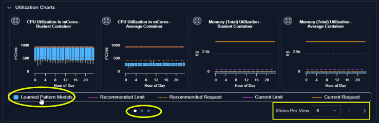
  <li>You can select or de-select the data displayed on each chart using the legend located below the charts.</li>

  <li>
    Click an option to add or remove it from the displayed charts.

    <a name="kanchor80" />
  </li>
</ol>

<Frame caption="Figure: Utilization Charts - Using the Legend">
  <img src="https://mintcdn.com/densify/zZdJaPjmZYmfrfqT/images/docs-kubex/Content/Kubex/03000089_738x241.png?fit=max&auto=format&n=zZdJaPjmZYmfrfqT&q=85&s=c2e79c186994004fc4bac9388c1b3584" alt="" width="738" height="241" data-path="images/docs-kubex/Content/Kubex/03000089_738x241.png" />
</Frame>

### Viewing the Other Charts

You can set the number of charts to view using the options in the lower right corner of the page. Select 1 to 4 charts to be displayed. Use the dots to the left of this selector to navigate left/right to see the other charts.

<Frame caption="Video: Chart Selection">
  <iframe src="https://player.vimeo.com/video/1054628370?badge=0&autopause=0&player_id=0&app_id=58479" width="100%" height="480px" />
</Frame>

## Expanded Modal View

<InlineImageWithText src="/images/docs-kubex/Content/Kubex/03000038_45x43.png">
  Clicking the zoom button opens the chart in a modal view with additional options to view the collected and analyzed data.
</InlineImageWithText>

The following options allow you to view all details your data:

<Accordion title="Table: Modal View Data Aggregation Options">
  <table>
    <thead>
      <tr>
        <th>
          Option
        </th>

        <th>
          Description
        </th>
      </tr>
    </thead>

    <tbody>
      <tr>
        <td>
          ML Model
        </td>

        <td>
          The data is aggregated hourly for the last day (yesterday) and displayed using quartile data. The timezone of the data is server on which Kubex is hosted.
        </td>
      </tr>

      <tr>
        <td>
          Historical Daily
        </td>

        <td>
          The container's data, is aggregated for a single day. You can see the minimum, maximum, sustained and average values by clicking on any data point. The timezone of the data is UTC.
          Use the slider at the bottom to select the historical days of data to review. Up to 90 days of data is retained.
        </td>
      </tr>

      <tr>
        <td>
          Historical Hourly
        </td>

        <td>
          The container's data, aggregated for a single hour. Like the historical daily view, you can see the minimum, maximum, sustained and average values by clicking on any data point. The timezone of the data is UTC.
          Use the slider at the bottom to select the range of data to view.
        </td>
      </tr>

      <tr>
        <td>
          Historical (5 Min)
        </td>

        <td>
          The container's data aggregated into 5-minute samples. This option is available for CPU, Working Set Memory, RSS Memory, Total Memory, and Restarts. The timezone of the data is UTC.
        </td>
      </tr>
    </tbody>
  </table>
</Accordion>

### Timezone Considerations

**Containers, Node Groups and Nodes**--The data in the utilization charts is displayed in UTC. The X-axis label indicates the timezone designation for all charts as "UTC".

**Cloud**--The historical utilization charts are displayed in UTC. The ML charts for cloud instances use the Kubex server time. This will be either “Eastern Time” or “Central Europe Time”.

### Using Policy Settings to Select Utilization Metrics

The Kubernetes Optimization policy settings allow you to analyze requests and limits based on different utilization metrics, e.g. memory request analyzed based on Actual Memory Utilization and Memory Limit analyzed based on Raw Memory Utilization. If these policy settings have been enabled the corresponding charts will indicate the selected metric settings.

Contact [support@kubex.ai](mailto:support@kubex.ai) for details on enabling these settings.

#### Video Resources

<AccordionGroup>
  <Accordion title="Chart Selection Controls">
    <iframe frameborder="0" height="310" src="https://player.vimeo.com/video/1054628370?badge=0&autopause=0&player_id=0&app_id=58479" width="550" />

    <a href="https://player.vimeo.com/video/1054628370?badge=0&autopause=0&player_id=0&app_id=58479" target="_blank">Using the Chart Selection Controls</a>
  </Accordion>

  <Accordion title="Using the Tree Viewer">
    <iframe frameborder="0" height="310" src="https://player.vimeo.com/video/1038945637?title=0&byline=0&portrait=0&badge=0&autopause=0&player_id=0&app_id=58479" width="550" />

    <a href="https://player.vimeo.com/video/1038945637?title=0&byline=0&portrait=0&badge=0&autopause=0&player_id=0&app_id=58479" target="_blank">Using the Tree Viewer</a>
  </Accordion>

  <Accordion title="Using the Utilization Charts">
    <iframe frameborder="0" height="310" src="https://player.vimeo.com/video/1042992591?badge=0&autopause=0&player_id=0&app_id=58479" width="550" />

    <a href="https://player.vimeo.com/video/1042992591?badge=0&autopause=0&player_id=0&app_id=58479" target="_blank">Using the Utilization Charts</a>
  </Accordion>
</AccordionGroup>